Wednesday, January 24, 2007

More on the Show


Its funny how much I need the approval of other artists. I was so excited all summer about entering the Fiber Artists of San Antonio (FASA) Annual Show.

I worked at my pieces with an incredible intensity. I learned new techniques and spent a, ahem, well, whopping load of cash on the materials. I found that it is hard to make art without the right materials and they cost money, serious money. I've had to admit that I will never have the resources to be more than a dilettante.

As I worked, I was so very sure that I would be chosen for the Show. I even imagined winning a prize. This was the best art I had ever done. And then I recieved that dreaded phone call..."we regret...". My friend - whose things were also not chosen - saved me the agony of picking up my rejected pieces. I was too humiliated to even attend the opening reception.

So what do you do with reject art? The smaller pieces went back on the wall. But the big piece, the expensive piece, still sits on a table in the hall. I have no room to store it. Shall I dismantle it and box it up with other large rejects? Should I just throw it away? Should I leave it behind me or re-work it into a "better" piece? I can see how I'd change it now. But should I?

It would seem that I have less a passion for art than a hunger for approval and admiration.

Wednesday, January 17, 2007

Lost and Found

The Show came and went and my pieces were not selected. My intellect can accept that this was one person judging on one particular day. But my inner artist was wounded. I reject myself so much that having an unknown judge reject my work feels like a cruel affirmation of some sort. Does this mean I am not mature enough to be showing my work? And yet I am hungry for admiration, for confirmation that I AM an artist; and I am competitive – I want to be “better than” whatever.

For six weeks I’ve done no art. I felt lost. I worried that I was not an artist at all – just a collector of art supplies. I’ve sat at my worktable and played around, reorganized, put things in rows and drawers. And I’ve journaled. Finally I picked up an unfinished altered book that I started for an Artist’s Way exercise. It is tiny – just 2.5X3 inches. My artist voice felt small and this small thing was what I needed to find myself again.


So here it is…”Songs to Aging Children”. I’ve used the text from the Joni Mitchell song because text IS important. Maybe what I’m doing is illustration – but that is art too.


Sunday, November 26, 2006

I'm Baa aaack

At long last I have returned. So much was going on in the last 8 months that I just didn't keep up. Slowly I'll start to add some of my latest projects plus try to stay up-to-date.

My latest find is MOO cards.
I just HAVE to share the info about these little gems. They are 1/2 the size of a business card (lengthwise).

You get to pick the pictures that appear on one side and write 6 lines of text on the other side. Well, what you actually get is a strip either vertical or horizontal out of your picture. The text is the same on all 100 cards. The cards themselves are incredibly high quality - feel like plastic impregnated cardstock. cost = 19.95 + shipping for 100. They are located in the UK so delivery to the US takes about 16 days. I love my MOOs. I used 37 different pictures of art projects. I got 3 of most of the pics and 2 of some others.
Go check out:
http://www.moo.com/


I am getting ready for the Fiber Artists of San Antonio Annual Show. I have 3 pieces for the show. I'll post pictures after they are juried on Dec.4.

Friday, March 31, 2006

Entre Acte - Star Book - March 30


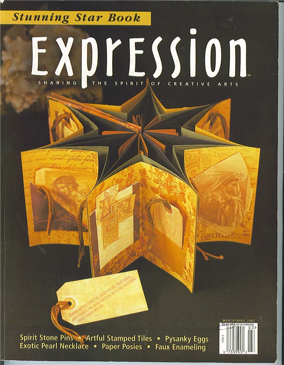
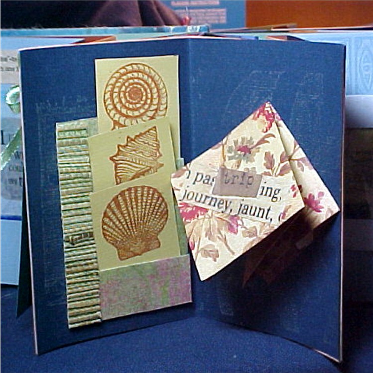
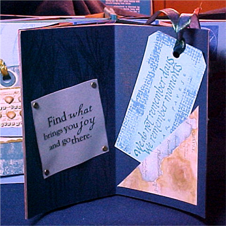
Several months ago, a guild member offered free magazines - I took them all and have been enjoying them VERY much. One project just captivated me...A Star Book. It was featured in Expression magazine in March 2002.
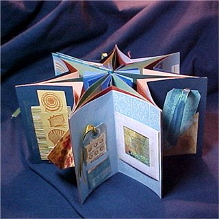
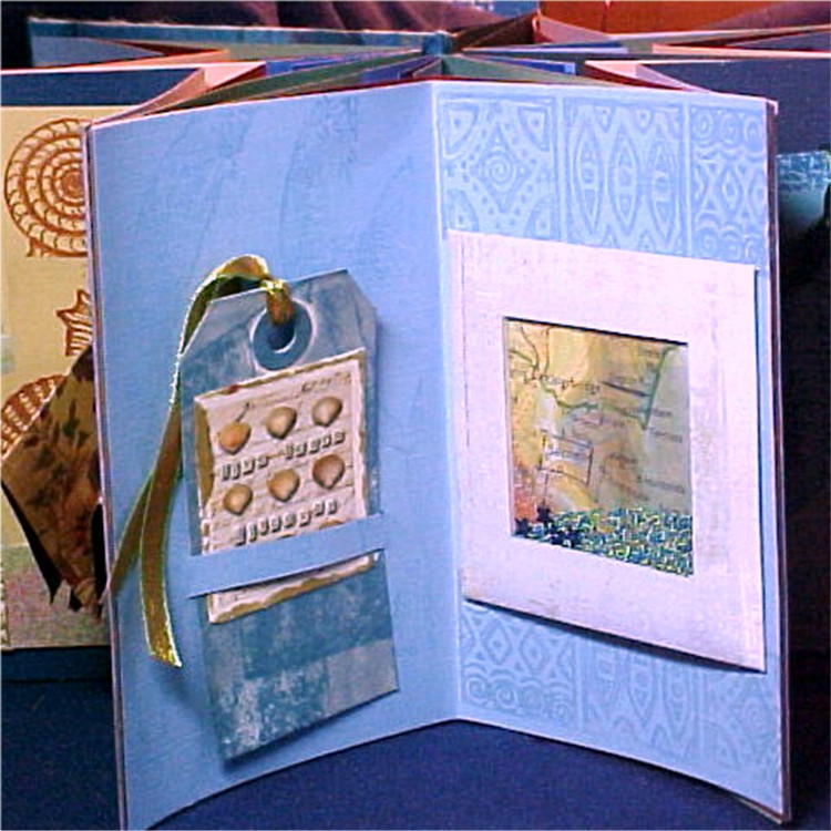
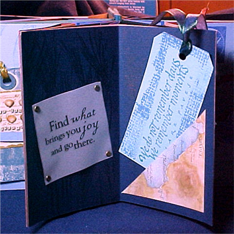
The instructions for cutting and assembling the signatures were very clear. I used sea and sand colors in mine, as well as seaside vacation themes in the pages.


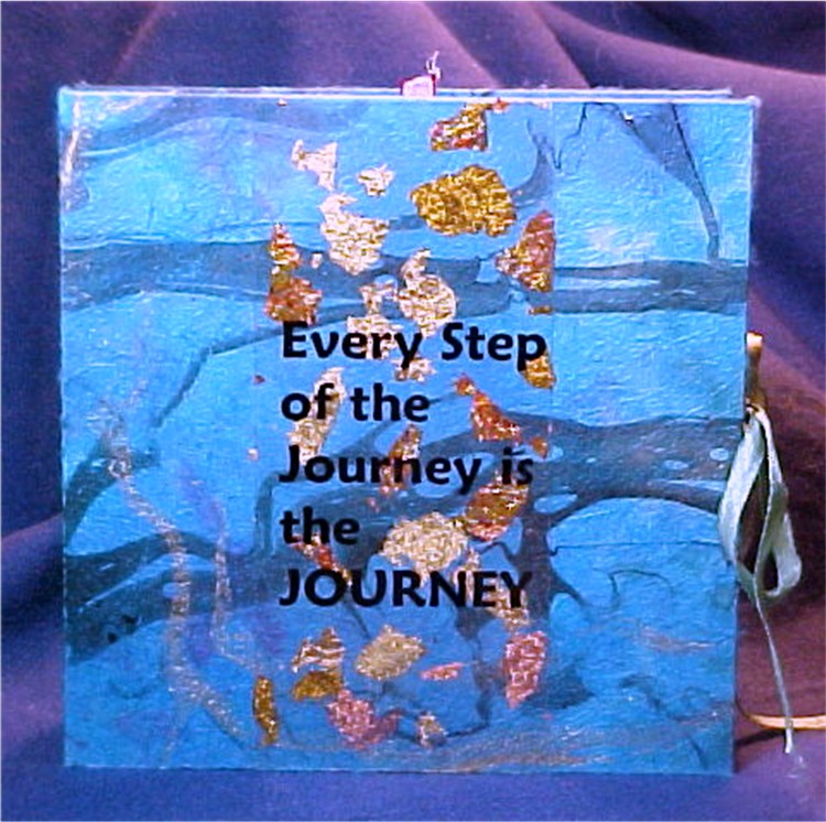
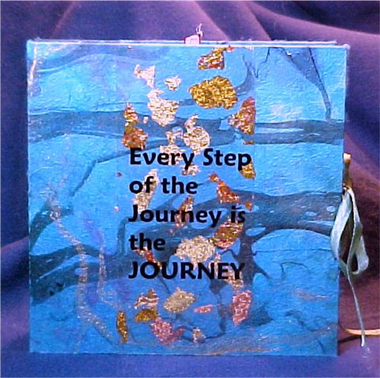
Most of the stamping was done with "Versamark" ink. It is clear and leaves an image several shades darker than whatever background it is applied to. The title is printed on a transparency, run through a Xyron machine, applied gold leaf flakes to the sticky side and then applied it to the cover which is a hand made marbled paper.

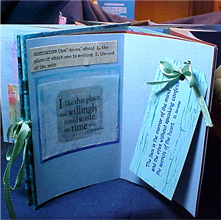
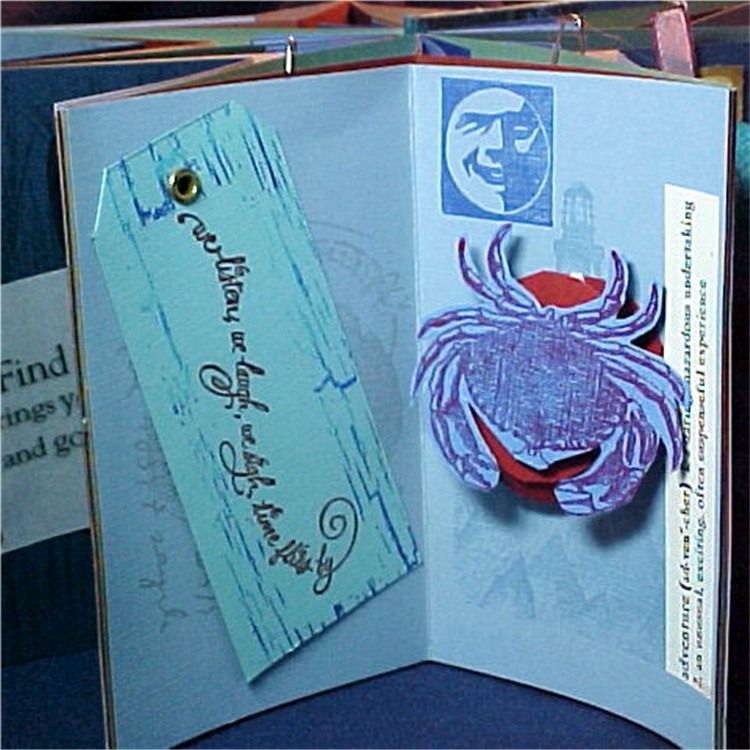
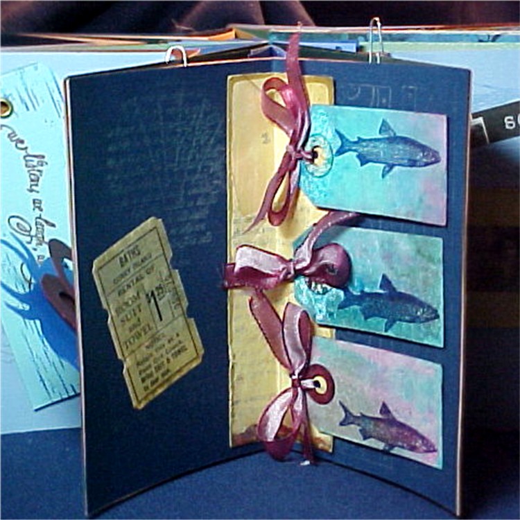
Its hard to see the backgrounds in the photos, cause they are subtle. The tags use stamps of quotes, masked and then background stamped.

On page 3 I made a shaker with a map of a coastline and a mix of green and blue mini beads and a few blue star sequins.

Since the backs of the outer layer are not visible, I was able to use brads and eyelets freely.


The crab is mounted on a spiral so it bounces around when the book is open.


The fishes page is my favorite...I don't know why, it just really appeals to me.

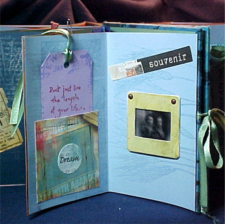
The last page feature a "slide" of two women from ...I'd guess the 40's. It reminded me of me and my sister and the trip we are taking together. I like the word "souvenir"...to come again.

Between Journals - The Mermaids - March 23


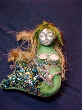
At our March Fiber Arts meeting several people were wearing these art doll pins that they had made at the Federation Conference. Oooo, I wanted one. I needed polymer-clay faces. So, I signed up for a class at Stamp Antonio and bought a push mold for the faces.

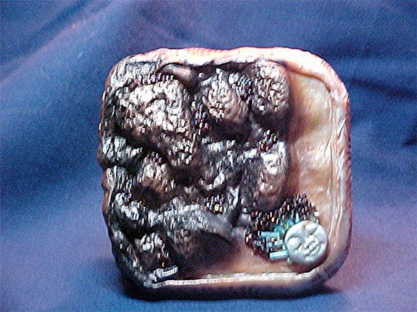
In the class, we made a box. Mine melted in the oven cause it was too hot, but - it looked really neat, like lava or some burnt artifact. But, most important to me, I was able to make a slew of little faces without having to purchase a toaster oven and a pasta machine. So - back to the dolls.

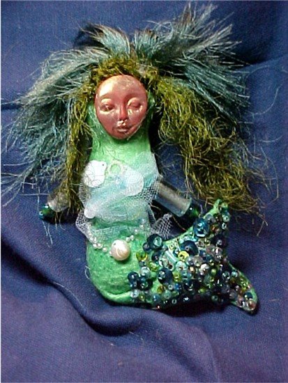
I tried to make a pattern and cut it out of felt - but it didn't work so well. Back to the store, this time for a "Shapelets" art doll template, which I changed just a bit by making a fish tail. While looking on the web, I figured out that I should make the tail straight with some wire in it and curve it later.

At the guild meeting, one of the members was giving away sequins and a whole jar of them were shades of green! I also dropped in on the local "Antiques Mall" and found a little box of pierced shells (among $25 worth of other chatchkies) I used some loom-waste silk threads for the hair.

So far...$4 worth of felt...$12.75 for push mold...$3.00 for pin backs...$25 for the class... $25 worth of "antique" crap = $69.75 for doll #1.

But I also wanted a pin for my sister Connie so we could match on vacation, and I knew I could improve. Mermaid #2 got BOOBIES. I needle-felted a great rack onto her and what a difference! I also held the curve of the tail with a sewn dart. I didn't buy any more stuff - so the dolls are now costing about $35 each in materials.

They were surprisingly quick to make up. The longest time was spent sewing on sequins and beads to the tail. Each doll took me a full day.

But we are gonna be zoomin around the boardwalk with our mermaid pins!

Brigitte's Journal - Paris. March 21, 2006


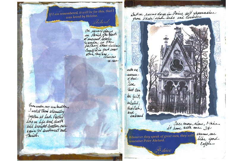
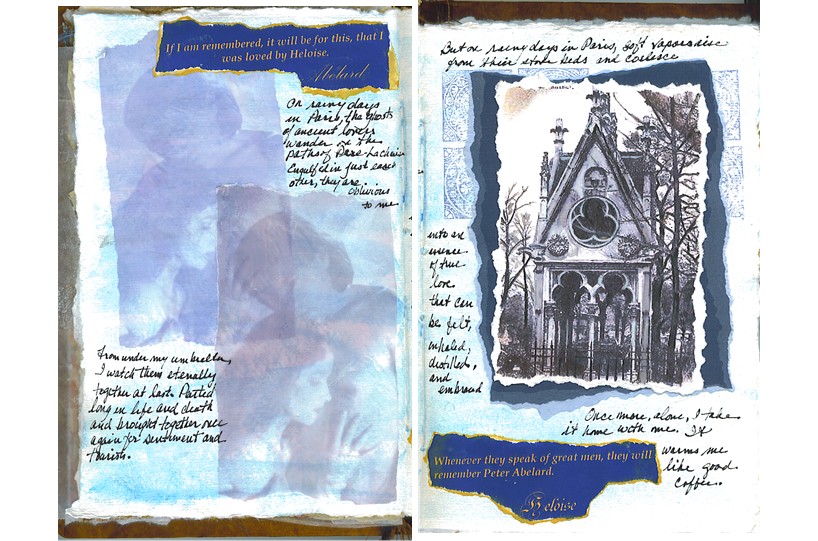
Brigette's journal arrived on March 11. Her theme is Paris, which holds special memories for me since I spent my early childhood there. It took ALOT of pondering and trial runs to get to what I wanted to say about Paris.

I chose the tomb of Abelard and Heloise-the famous lovers. I've always wanted to be in Paris as an adult and in love - but I've lost that chance and Abelard and Heloise also embody for me that loss. I printed a postcard of the tomb on water-color paper. Then I actually watercolored over the printing - that worked really well! I noticed that once again I used a difuse blue-sky background. Guess its not out of my system yet.

Saturday, February 18, 2006

Kim's Journal


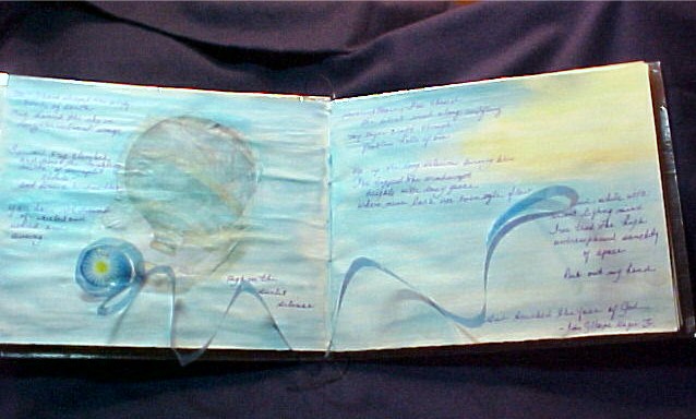
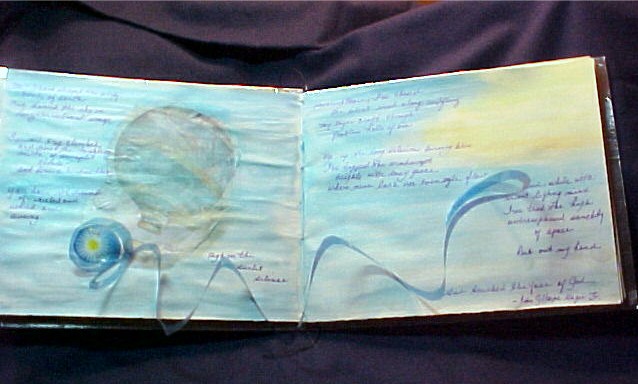
Kim's journal arrived on the 9th of February. Her theme is the Elements..Air, Earth, Fire and Water as they relate to your zodiac sign. As an Aquarius, I'm an Air sign. Boy, air is a tough topic.

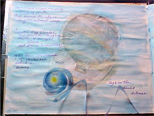
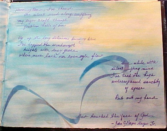
I've been working with the Neo-paque water soluble crayons and they seemed just the thing for creating a light and airy background. Instead of water, I used diluted gesso to blend the colors. I loved the result! I found a picture of an old-time hot air balloon and printed it faded out on a piece of tissue paper.

I wanted someting to represent wind and decided to use a spiral pop-up. I printed a circle-cropped design on a transparancy; well about 6 different ones. It was hard to get the color and the size just right. Then....(drumroll please)....I ruined the whole bleepin' thing by glazing over it with a pearlessence blue glaze. Instead of being light and airy, it looks like some 3rd-grader's rendition of the sky! But there's no going back when its a traveling journal so I forged ahead and put in the poem 'High Flight', which I really love.

I'm disappointed in the result and Kim, I'm sorry!

Friday, February 17, 2006

Between My Journal and the next


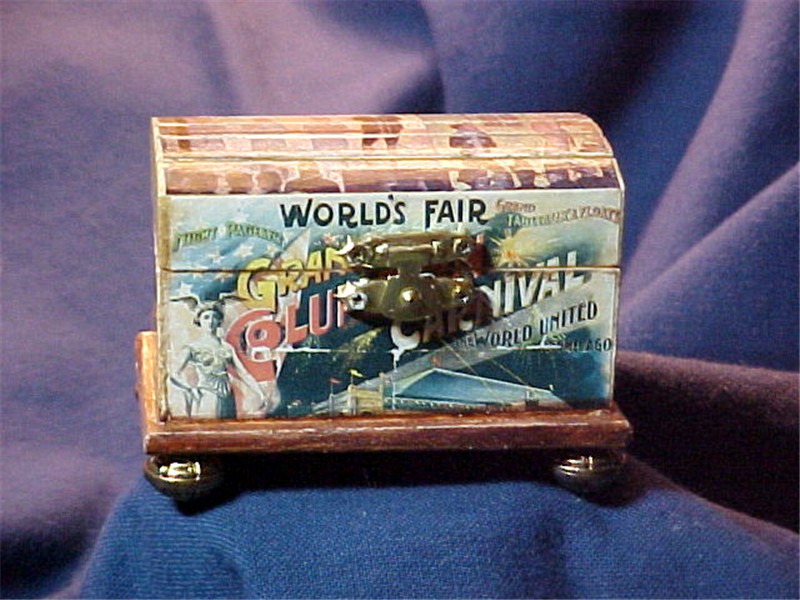
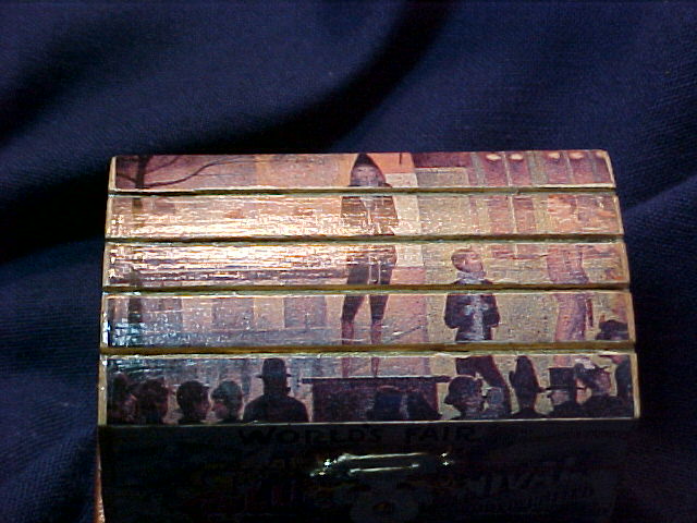
As I was organizing my supply cabinet, I ame across some little boxes; several papier mache and one of wood. I decided to collage some of these. The wood box was a challenge because it had a domed lid of raised planks, sort of like a pirate chest. I found a picture to fit it and glued and cut along each plank so that the picture was in strips.


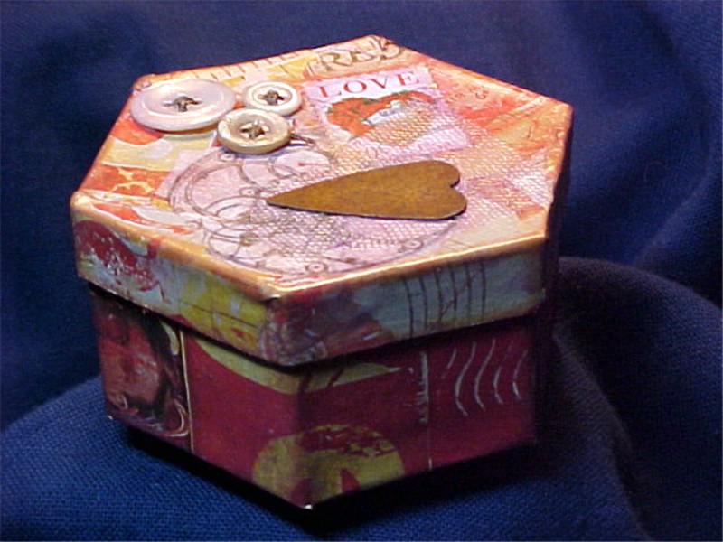
The paper box is a hexagon. I used a clip-art page from a Somerset Studio magazine and little bits - buttons, a rusty tin heart, a "love" postage stamp, a piece of tulle. I glazed it with pink pearlessence powder mixed into a gloss medium. On both boxes I used beads as feet.

The holidays came and went and I had itchy fingers! The next journal installment wouldn't be here until after Feb 6. I took a retreat/workshop on Artist's Journals during January that was a very enlightening and oddly spiritual experience. There were 5 other women besides myself. They were all so accomplished and intellectual that I ended the first day feeling very insignificant. One of them talked about owning the name "artist" which made me feel like a fraud. But I learned that part of being an artist is believing that you ARE one. After lunch the next day I was talking to one woman that I really admired and mentioned how intimidated I was feeling - and she said that I intimidated HER. In a strange way, that made me feel good about myself.

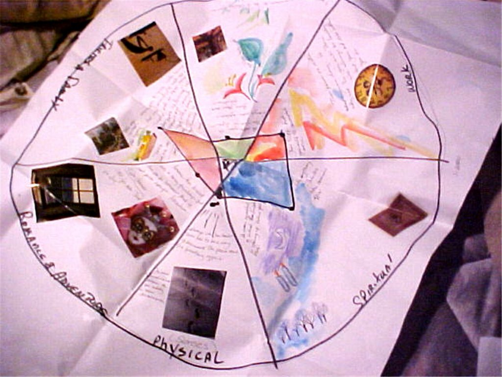
We did several memorable exercises. In one, we divided a circle into six pie wedges, labeling each wedge as a componant of a balanced life...physical, spiritual, work, play, friends & family, and romance & adventure. We put a dot in each to signify our satisfaction with that aspect of our lives...the closer to the outer edge, the more satisfaction. We did this on very big paper and wrote and illustrated each wedge. It is a great way to snapshot how you feel about your life and if you do it , say, once a year - its a good barometer.
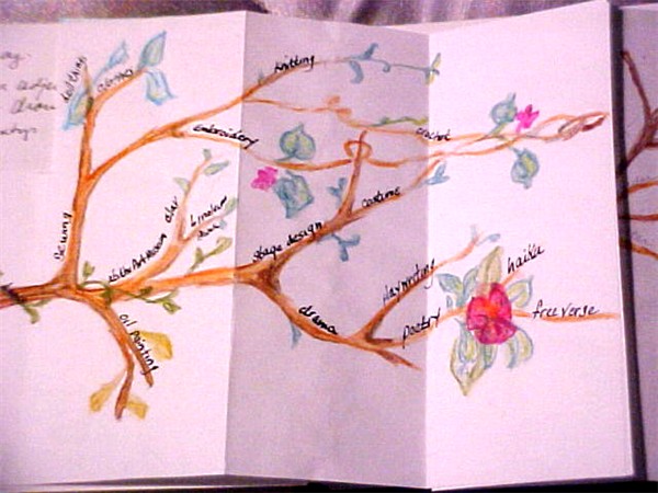
In another exercise we drew a map of our artistic life - where it came from, where it is now, and where you want it to go. Mine became a tree with branches instead of a map - but it works the same way. It gave me insight into my growth in the arts and helped convince me that I AM an artist and have been for a very long time.

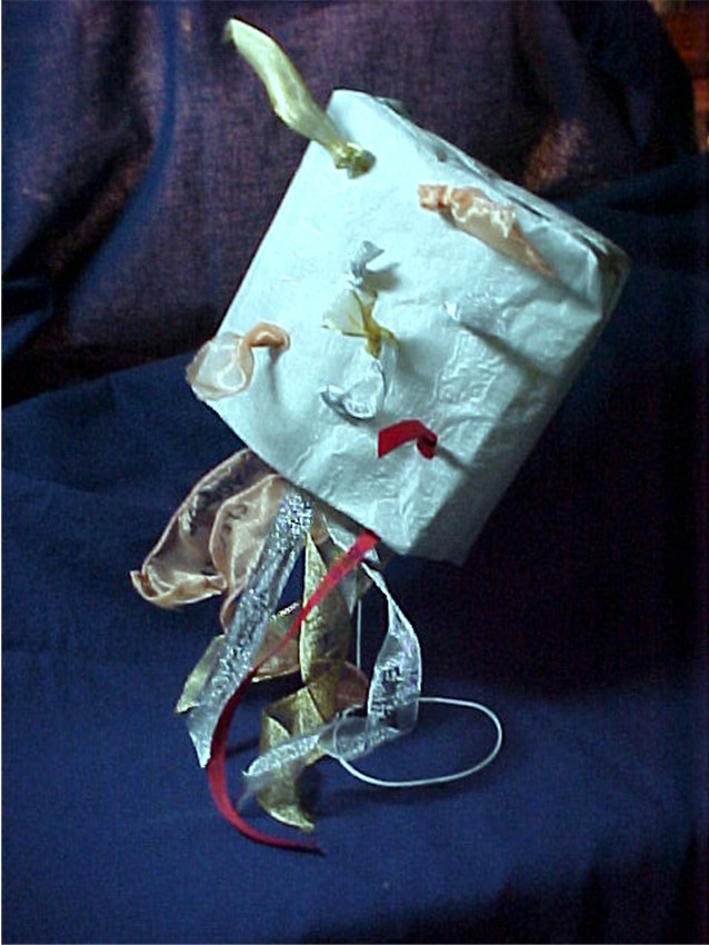
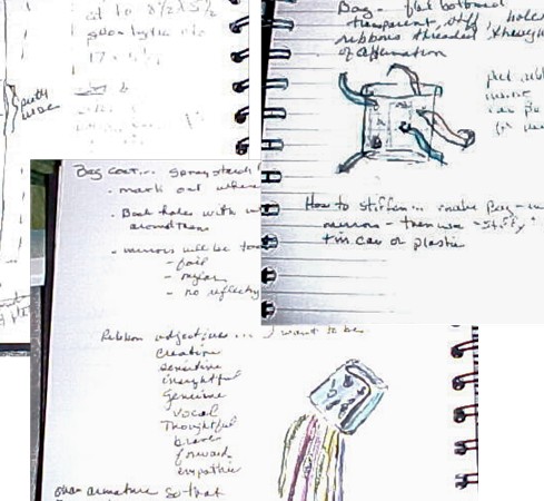
The final exercise of the weekend was to build a container that represents your artist self and record the process in our journals. I created a silk bag that spilled out ribbons with adjectives on them of qualities that I wanted in my life...creative, sensitive, insightful, genuine, vocal, thoughtful, brave, forward, empathetic.
I have a habit of journaling plans for projects and never following through on actually accomplishing them. It was very exciting to plan a project and have it come out just the way I envisioned it. I've used this method to plan journal pages and it is great to have a record of how the finished page came about. The bag is mounted on an armature and sits on the top of my loom to remind me every day of all that I can be.

Wednesday, December 28, 2005

Jumping off the Art Garage roof


So, here I go again. This time its an art journal round robin. I have been shopping for blank journals all over the place. The ones at the bookstore already had beautiful covers and they were mostly lined (yuck) and of rather flimsey paper. At the art supply store they were mostly ugly spiral bound things with only sketch-weight paper.

I thought of making one of water-color paper, but I was thwarted again. The art supply store only carried Arches papers which I've been told have very short grain fibers and they crack when folded. Then, at the rubber-stamp store, way back in the corner of the rubber stamp store were book making supplies!

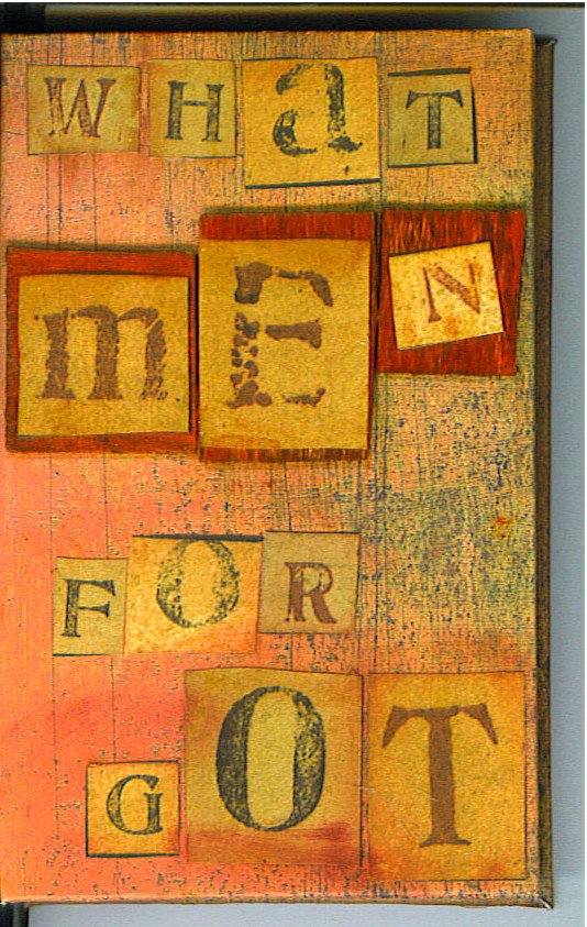
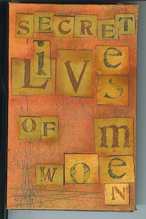
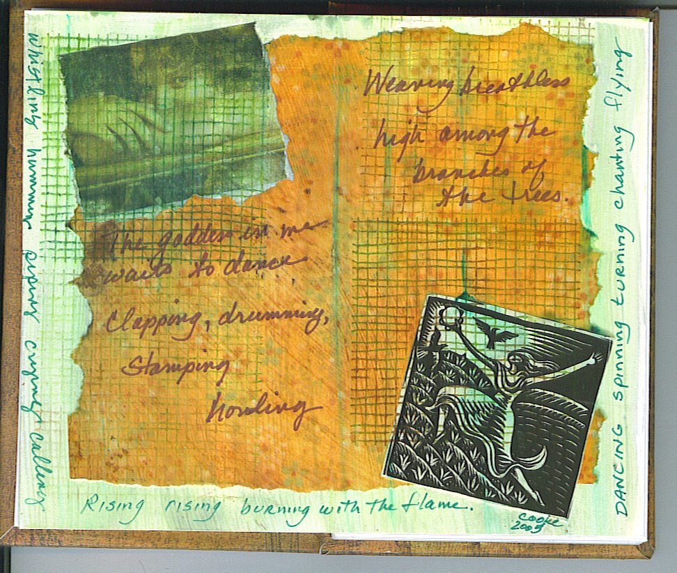
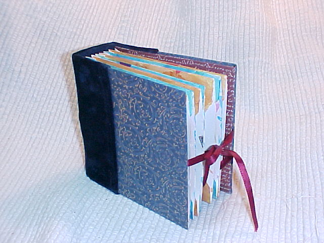
So I have made a small format (3" X 5") accordion pleated, reversible journal. Side one is titled "Secret Lives of Women". The flip side is "What Men Forgot". I hope a few people use the space and do an entry on each side. I used the first spread for instructions and then a collage on the next.


Thursday, December 15, 2005

....the devil's workshop


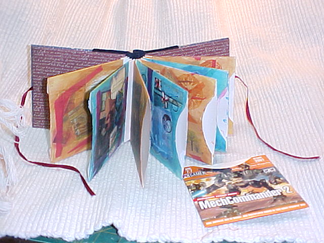
Now that the altered book project has finished and the art journal project hasn't begun, I've had the old "idle hands" problem. While cleaning up my work space I realized that I've accumulated a lot of small collage scraps which tend to get swallowed up in my bigger scrap bin. I've tried saving them in plastic page protectors and in little boxes - but both have been unsatisfactory.

Then this week, several serendipitous things happened. First, I found that someone had given me tiny scraps stored in a CD envelope. Then my husband was tossing his old PC gamer demo disks - and they had very sturdy cardstock envelopes - so I kept them. Then I got an email offering an Art Journal retreat from a teacher whose workshops I've always enjoyed. Finally, a collegue at my Fiber Arts Guild gave me all her back issues of Somerset Studio.

I saw right away that the CD envelopes would be a super way to file all those scraps, so I gessoed a handful. I was wondering how to manage them as a filing system when I ran across an article in one of the old Somersets I was reading about a tag book. Light dawned and I saw how I could make a book of the envelopes. So I glazed and collaged for two days and today I put it all together! Now I'll be able to take a collection of small scraps with me to the retreat. And it looks good too!

Friday, December 9, 2005

Photo Finish

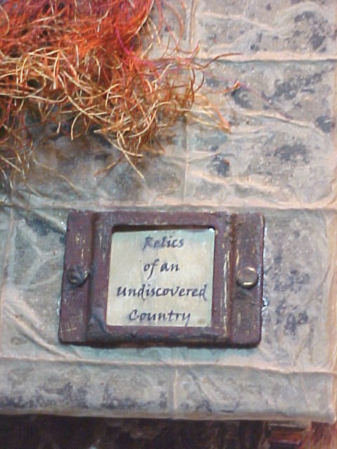
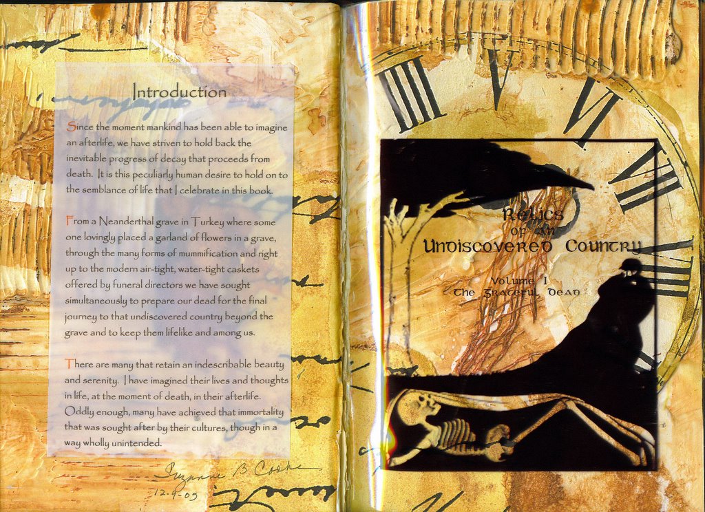
Today I finished the book! The final title is: "Relics of an Undiscovered Country Vol. I: The Grateful Dead." Not that there is a Vol II- it just sounded neat.

The *&^%bleepin#$@ adhesives still don't want to dry...each in its own way. The "permanent" gluestick lasts about 3 days before evaporating into the air or something. I had used it to glue pages together, at the end, a lot of the pages were coming apart, so I had to force glue into the open parts...not fun. Acrylic medium feels dry but sticks to opposite pages also glazed in acrylic no matter how long its been since I glazed them...the stuff never dries completely. Sobo glue doesn't act like glue. Nothing sticks for 5 or 10 minutes - then bingo - it works.

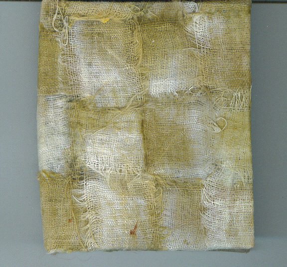
So - the cover of the book is done in "oil paper" with a linen thread grid. This paper is very crisp and crackly so I wetted it (brushed water onto both sides) to make it more pliable. This worked great for actually wrapping the cover onto the book. Once it dries, it is crackly again and tends to tear at stress points. This is an OK look for a Decay theme, but not so good for the book. I experimented, and found that hand moisturizer lotion keeps the paper pretty supple and less likely to break.

The cover art is a rendition of a Peruvian mud-mummy with macaw feathers and false hair made from silk ravellings. The doll is made from sticks and linen twine and paper-clay painted over with a tinted gesso. The title frame mount is treated with rusting agent. I had to tie the book shut because I have many dimensional elements that I didn't plan ahead for. That is the drawback of pre-glueing all the pages.

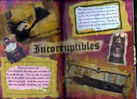
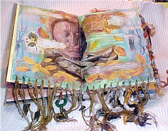
I've updated a couple of spreads...fixed Incorruptibles to cover the blemishes from it sticking together . I also added the weedy fringe to the Bog Man spread.

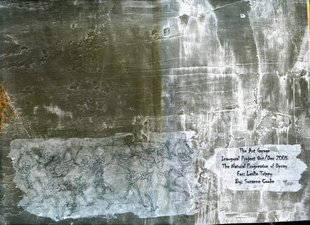
The inside front cover spread was a particular problem. Putting a spread here is just not my style. I prefer an endpaper that loosely keeps to the theme of the book. So I was very minimalist in this space. I found a paper that looked like distressed and dirty paint and simply added the group and project name with dates and who the recipient is. The inside back cover hold the niche, but has a facing page. which I used as a sort of recap - "How to make a Mummy". The distressed box is decorated with crackle medium over rust. It contains rose petals, myrrh and a pewter scarab pendant.

Last - my artists statement. Sigh - this gave me a lot of trouble. Various renditions were too stuffy, too casual, too pedantic. I can't say that I thrilled with the final version, but at least it sounds more like ME. I like the title page a lot. I played around with parchment and tissue and white and colored papers, finally deciding on a transparancy.

I am so not wanting to give this book away! It is probably the best art I've done. My plan is to make a PowerPoint slideshow of the pictures. I still need to make sure that I've saved all the narratives. Then its goodbye and I wait for my exchange to arrive.

Thursday, December 8, 2005

Moving towards the finish line

I've been putting the finishing touches on. I had to outline the last 10 steps because I got bogged down on which steps were dependant on others being done. This end-game has been more like an engineering project than art. The glue and acrylic medium drying is still a big annoyance. I had another spread stick together - at least it was the Incorruptibles page which I wanted to add to anyway.
I was very glad for the extension to the 15th. I spent my extra time mostly in bed feeling very crappy and achy. We thought it was the flu until the newspaper described a more virilent than usual cedar-fever season. Cedar-fever works like hay-fever but is tied to the winter blooming of some invasive juniper tree that is called "cedar" here in Texas.
There will be pictures soon.

Wednesday, November 30, 2005

Filling the Niche

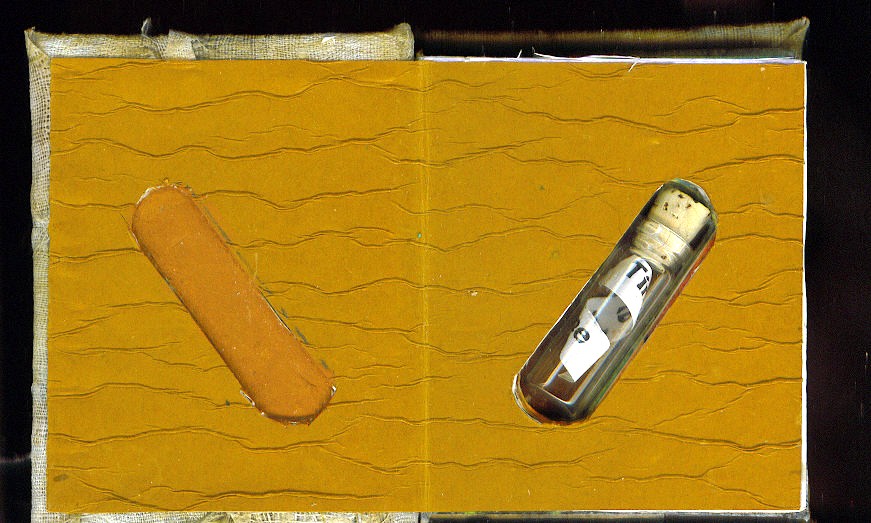
I was so surprised when I saw Sharon's tiny book on her web site, cause this is what I have done to put into the niche. Great minds definately think alike! This tiny book is 3.25 X 2.75 inches. In keeping with my theme, I made the cover from distressed and dyed strips if linen. The strips were woven and them painted with acrylic medium to make them durable. Then the cover was cut from this sheet.

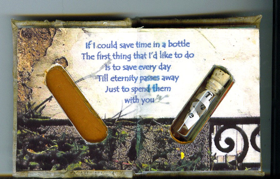
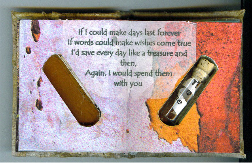
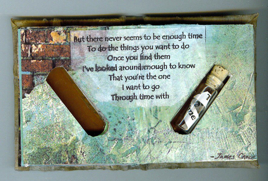
I had gessoed and covered the book in the first week, but couldn't come up with an inside. After I came back from my brother's funeral, it just seemed to flow. Each of the 4 2-page spread is a close-up photo of a degrading surface. I added a verse from Jim Croce's song "Time in a Bottle" to each page and then carefully cut the holes in each page to allow the little bottle to show through. Inside the bottle is the word "TIME" repeated on a curled paper. (More photos at the group's photo album)